
Marketing Scientific Services: What Website Functionality Looks Like
As far as I’m concerned, there’s only one type of website functionality that matters, and all things flow from it. In our world functionality and “strategy” are the exact same thing. The strategy is to get the person on your website to email or call you.
The only thing that matters is calls and emails, which in the web world are called “conversions”.
Let’s put a fine point on it. Some might think that answering every question a person might have BEFORE they call is the goal. I disagree. There are people out there that like reading, who stalk a company and formulate questions before they call. Others just want to get their specific questions answered by a human. Puking everything you know about the scientific services you sell onto a webpage is not a strategy for getting someone to call you. However, those readers still need to be accommodated. Other’s of you think the site needs to be “pretty”. Visually appealing is subjective and while it’s necessary, your clients didn’t come to view fine art, they came to see if you sold something they need and if they can buy it from you. The mission is to sell what they came for as fast as they want to buy it.
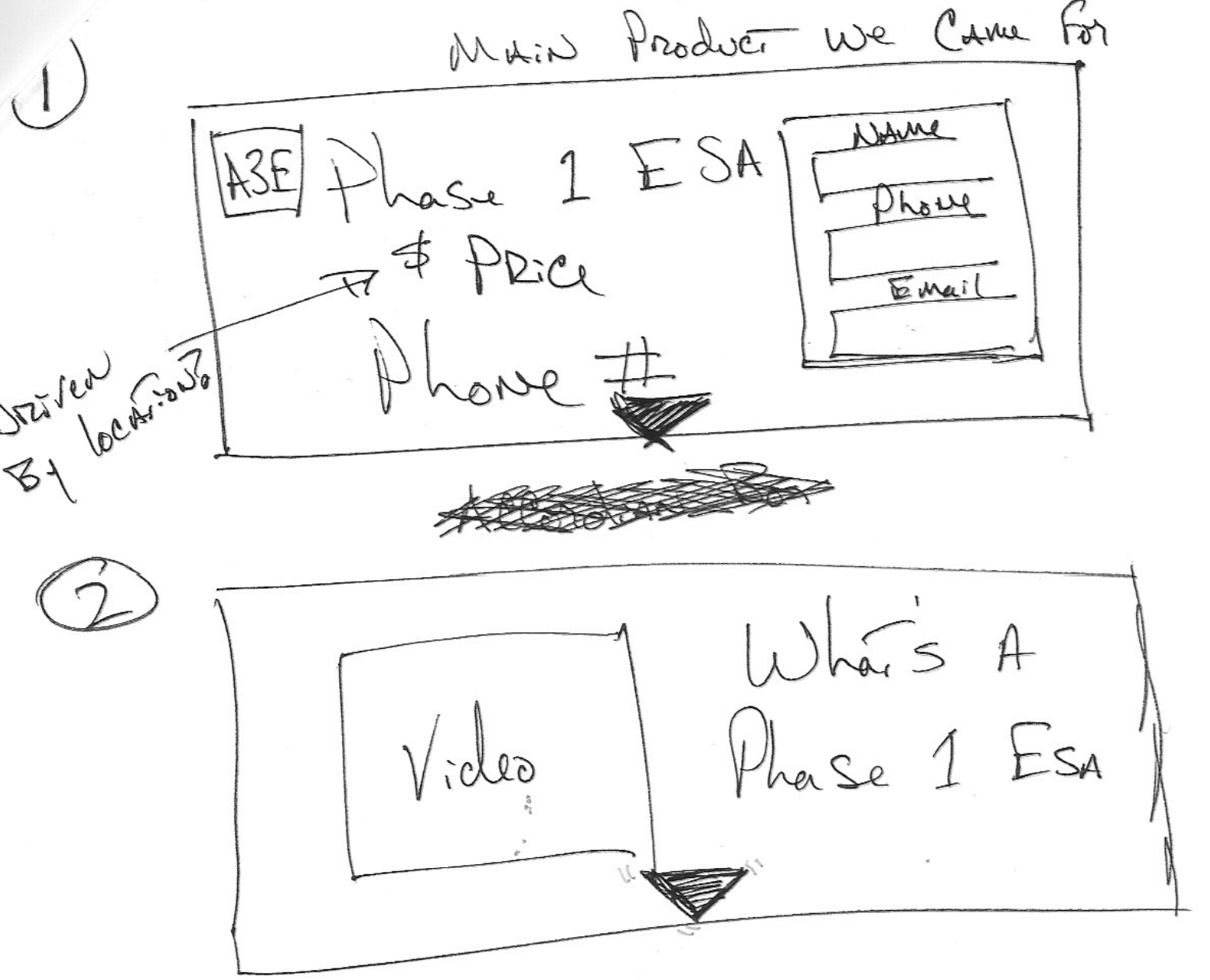
Our current website is on version 5. It incorporates all the lessons I’ve learned over time. The most major thing I learned is called “The Landing Page”. This is where you build pages that specifically cater to what the person landing there is looking for. What’s more, is we present them with what they are looking for in the hierarchy of the client, not the marketer.
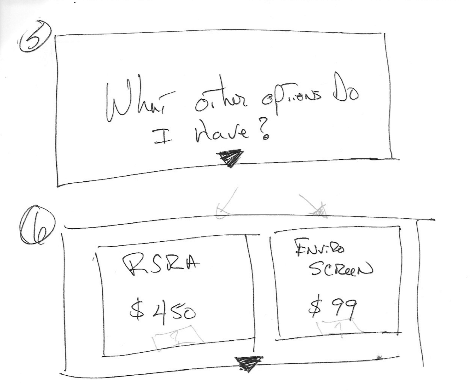
What this means is I assume the persona of the lander on my landing page and try to get them to call (email) me as quickly as possible. From there I start answering their questions and making them comfortable working with us. Always close is a way to call or email. I also present them with alternatives to the product I’m selling in the event they want less expensive or higher quality alternatives.
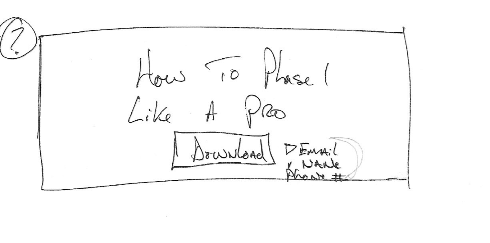
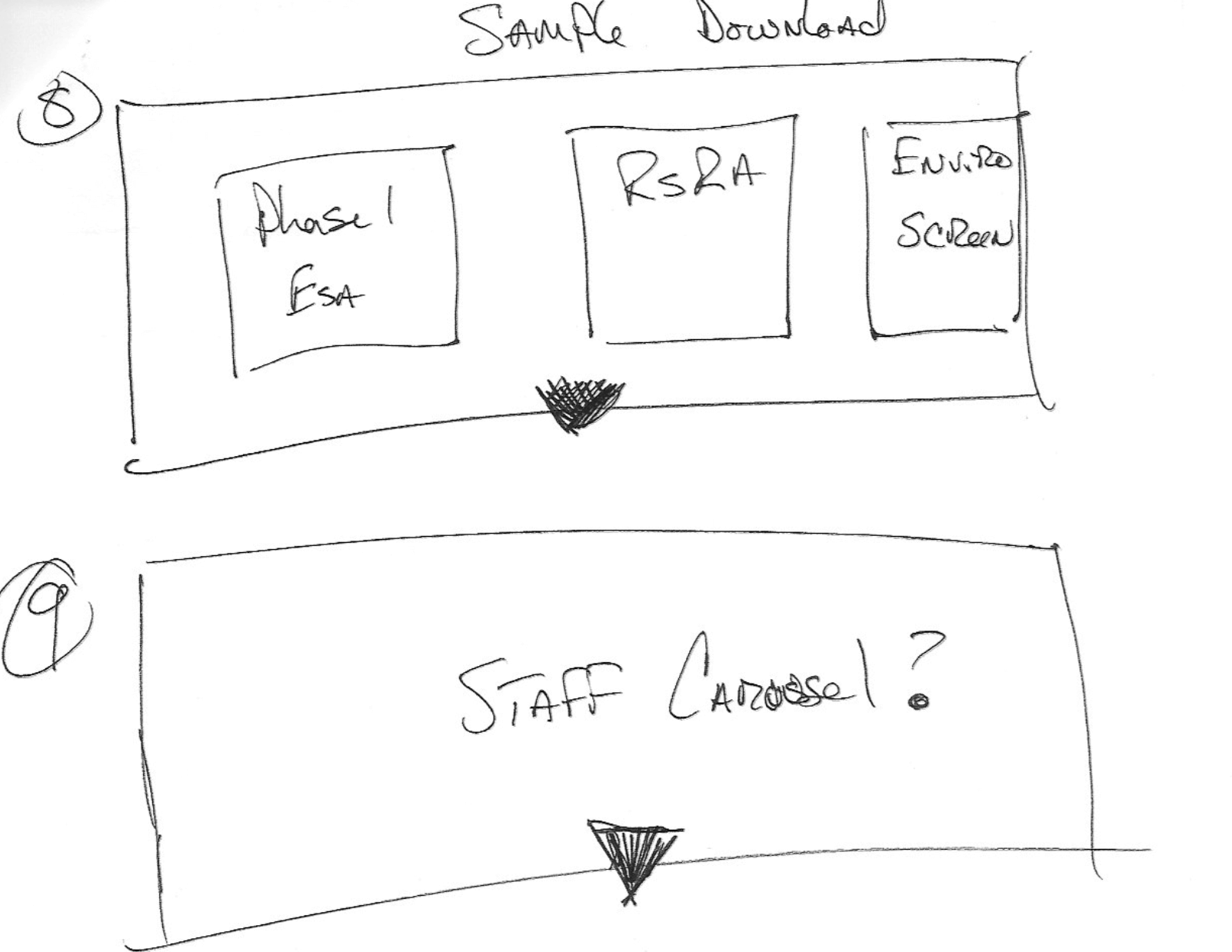
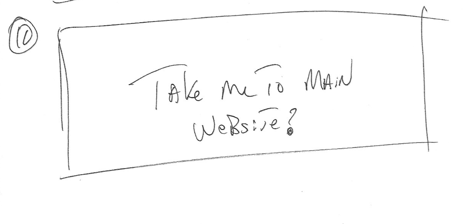
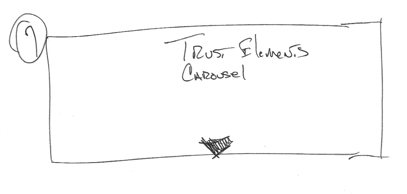
Before I took responsibility for our website, I tried to pawn it off on a subcontractor. I thought having a pro manage the site would get us a better look and better results. It didn’t. It was the same as I could have done myself but by outsourcing the job I didn’t learn anything and as a result, I couldn’t maintain the site. It was a train wreck. Back when I was trying to outsource what I wanted, I hand drew what was in my mind. The images below are my notes. This was a cool exercise and had a lot of value in helping me understand what I wanted.
.
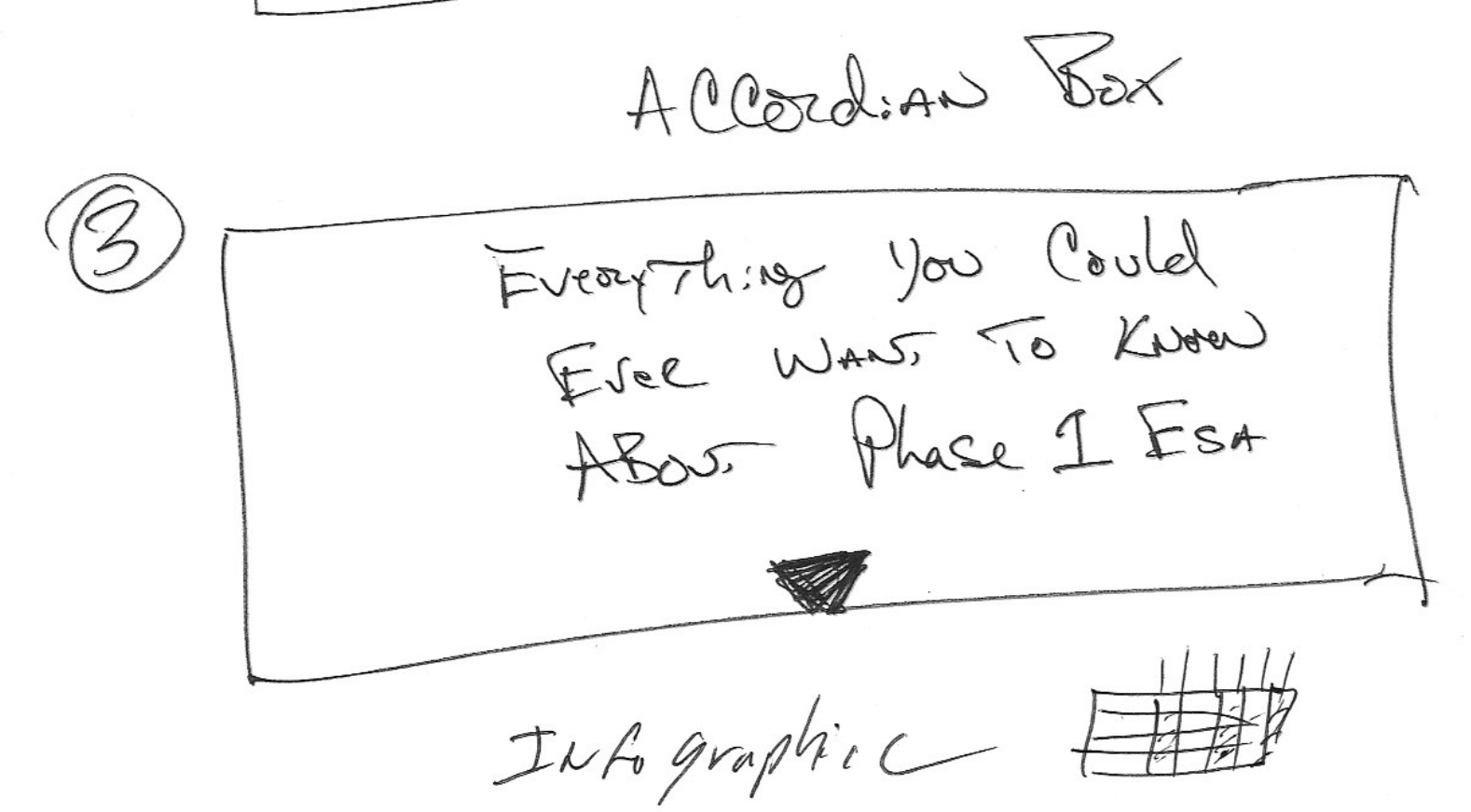
I used a WordPress theme called Kallas which, to be honest, is written by some eastern European as evident from the training videos. It was not that hard to figure out and it helped me create the style that I was looking for. You will notice that each panel has a chevron at the top and bottom pointing down. It’s a subtle clue to scroll down for the user. I hid my enormously wordy sections behind ‘accordion boxes’ which expand when they are clicked on. Someday I’ll link up my Google Analytics account to the accordion box and see how many people understand how to expand it. I imagine it’s low.
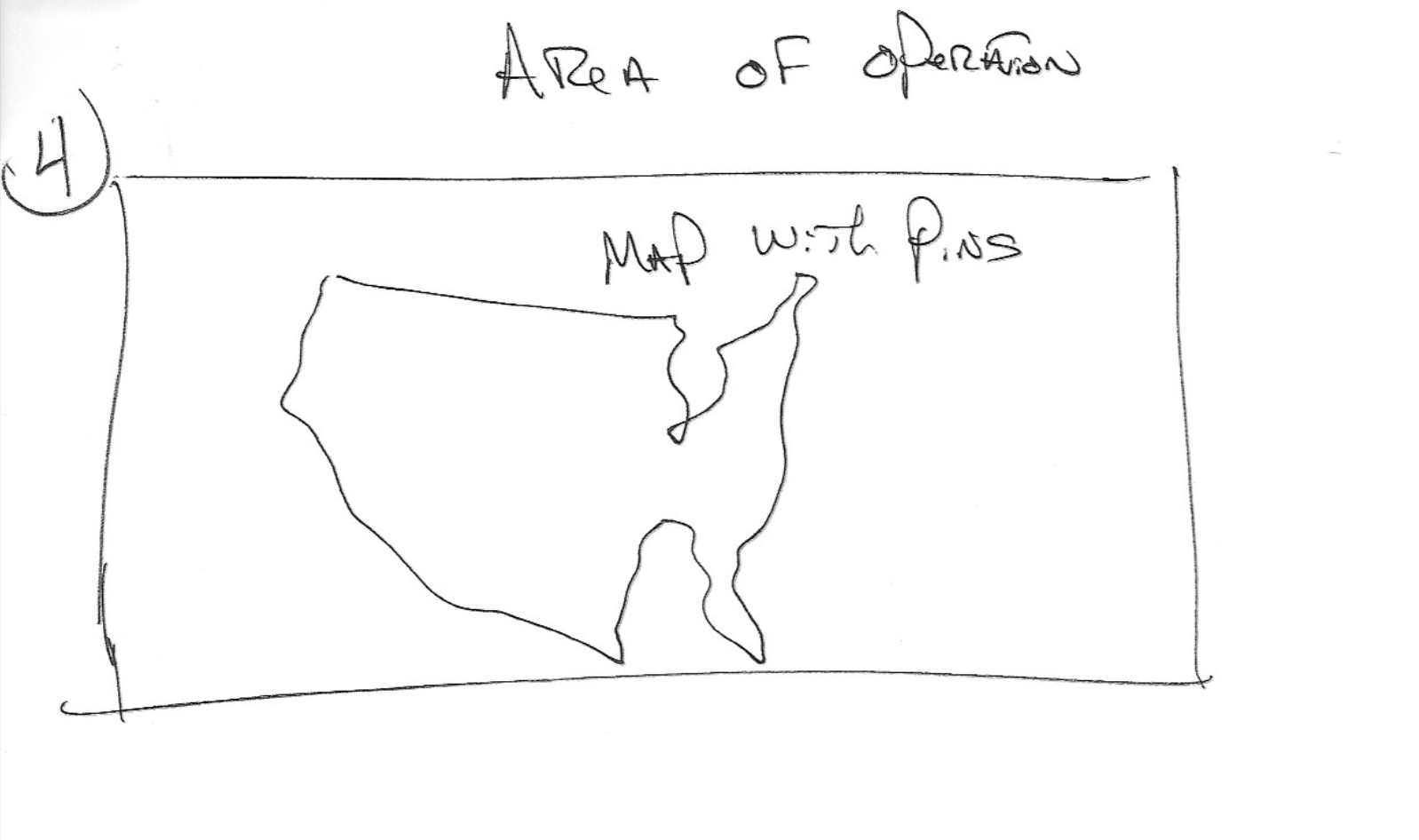
If I said anything today that I’d like you to remember, it’s that I didn’t set up the progression of the page to tell a story from start to finish. I imagined what it would be like to be my potential customer and I addressed their needs in order of how pressing they were. My first assumption is they want to call, email or otherwise get a price from me for the work we do. My first panel is designed to get them on the phone with me as quickly as possible. It’s only after that, that I start trying to talk about the product itself. I give them bail-out points to more expensive and less expensive alternatives to the product page they landed on. They are never far from a phone number, email or dialog box.
- Background. Hosts, Platforms, Themes, IFrame, Plugins, Third Party Software
- Nobody cares about your website, you should care less, a lot less.
- What functionality looks like.
A3 Environmental Consulting is a Chicago Illinois based due diligence and soil & groundwater remediation company.


