
This story cannot be told without giving proper respect to what started me down this rabbit hole. Strong Towns is a book I just read, after watching their YouTube channel for about 18 months. To be fair, Not Just Bikes, City Nerd and City Beautiful had a big impact too.
The premise of the book is essentially this; the vast majority of our towns are functionally bankrupt. As Ernest Hemingway famously said; “We go bankrupt gradually, then suddenly.” American cities are in the “gradually” phase.
Below is a map of tax revenues per acre for the town I live in. As described in the Strong Towns book, it’s pointless to think of tax revenues in terms of dollars per parcel of land. In much the same way, it would be pointless to think of fuel efficiency in a car as miles driven per tank of gas. We have no idea how big the tank is, so miles per tank is an irrelevant metric, miles per gallon is much more illustrative.
Click here to explore the interactive Winfield Tax Heatmap.
Lessons Learned?
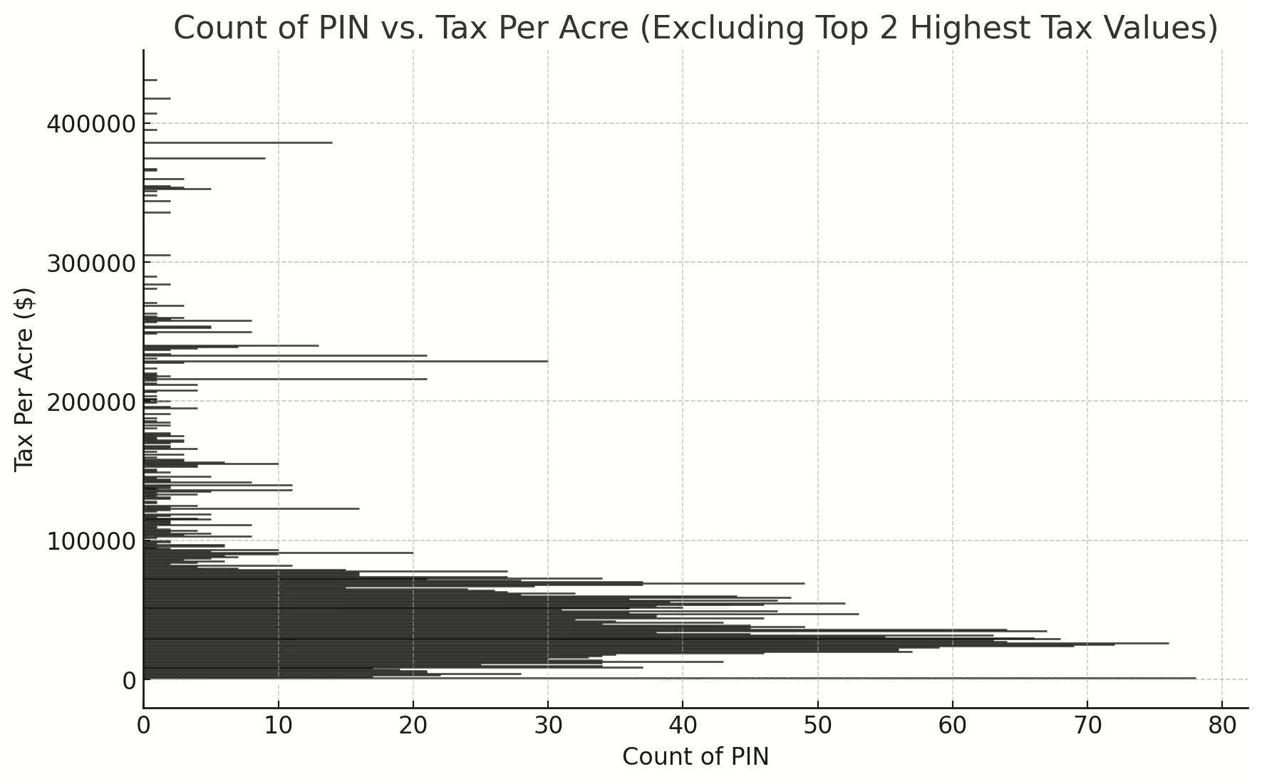
The taxes Winfield receives on a dollars per acre basis range from an enormous number paying zero dollars, to a maximum of $1.4 Million. (There’s only 1 of those) Which I believe is a shockingly wide spread. I would have expected the data to make a pretty bell curve.
The section of parcels paying for values over $100,000 per acre is a fraction of those below.
If you look at the interactive map above, you’ll notice the highest revenue parcels are the smallest area. This isn’t a particularly shocking insight, but what IS shocking is the most revenues per acre come from the poorest parts of the town with the smallest houses.
Essentially, those McMansions on enormous lots are being subsidized by the blue collar workers.
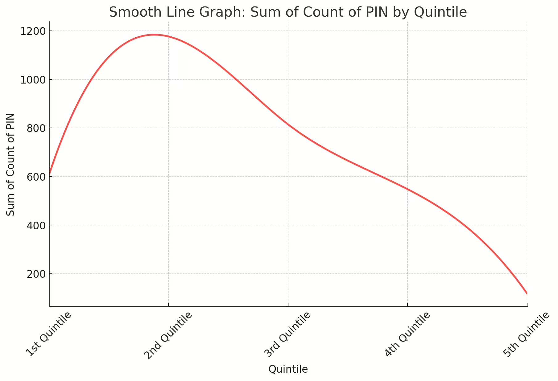
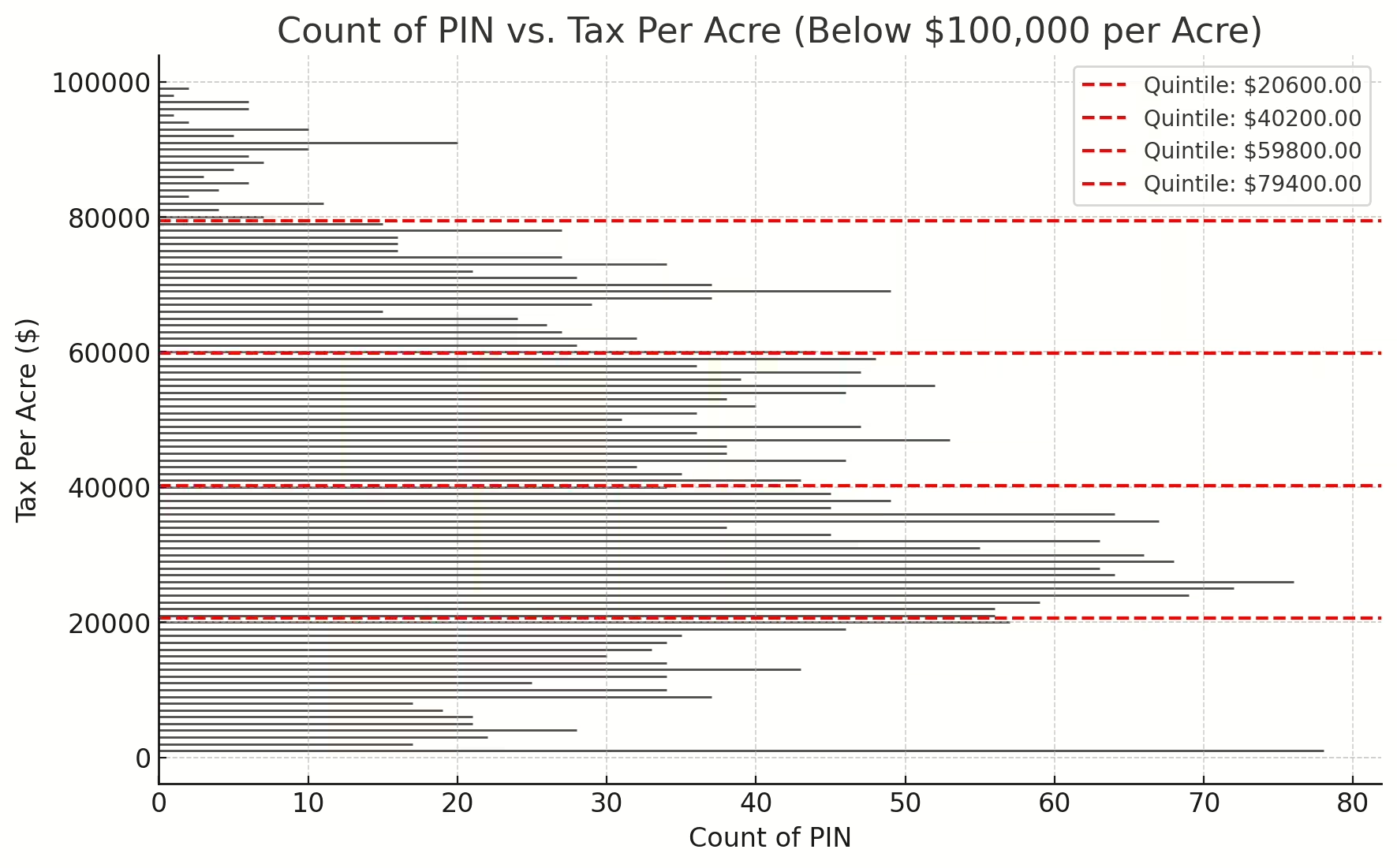 Property Tax Quintiles
In this figure, we take a close look at where the bulk of the tax revenues come from.
Broken out into quintiles, you can clearly see the revenues are skewed to the bottom of the graph. I live on 0.30 acre lot in a single family home. In real dollars my taxes are $9,600 dollars. At that rate, taxes per acre are $32,000.
One subdivision away, a parcel that is 0.07 acres (400% smaller than mine) is paying $4,700 for cost per acre of $68,000.
If you think I’m making an argument to lower the taxes of smaller lots, or raise the taxes of larger lots, I’m doing neither, I’m arguing to provide towns with the revenues they need to pay their bills and the insight to know where their revenues are coming from. A town should endeavor to raise the value per acre to best utilize the major resource they rely on to pay the bills, land.
Quintile Distribution
As interesting as this information is, it doesn’t even come close to telling the whole (sad) story. For that, we’d need a very good accountant, an engineer and a talented cartographer (like your pals here at A3 Environmental Consultants)
The parcel I live on is a corner lot. I have street frontage on two sides. Under the ground, I have a run of city maintained water infrastructure and sewer. Based on the size of my lot, these three infrastructures are longer and as such, more costly to replace than my counterpart in the .07 acre lot.
Not only are the least expensive, least wealthy people in my town paying the most taxes per acre, but they are paying the lion’s share of it to maintain the infrastructure servicing my house.
The appropriate way to divvy up the expenses is how Common Area Maintenance (CAM) is divided in commercial leases. Essentially it would be a function of the common area costs versus the area inside your lease.
Now What?
This is a big conversation with many more points to be made but we’ll have to do that over time. Until then, explore the map and see what insights you glean from it.
